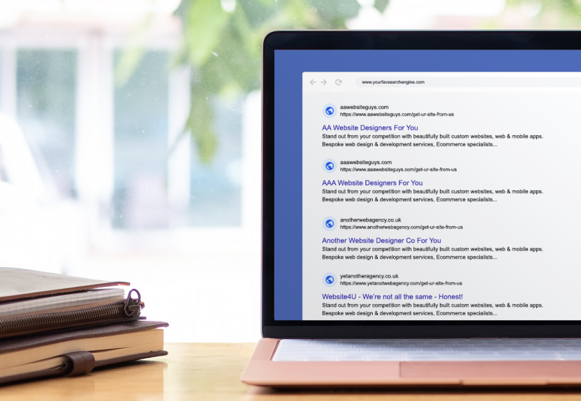
Have you ever created a landing page, covered off everything that the brief required, ticked all the boxes, got sign off from your boss, only for it to fall flat on its face and achieve embarrassing results? If so, you're not alone...
This problem often plagues online marketeers, especially when first starting out. But fret not, this post is has been created to cover off the basics, giving you a grasp of the key elements to consider and start you on your way... and if you're still in need of some help, get in touch with our expert team and we can do the hard stuff for you instead ;)
A well-designed landing page can significantly boost your online revenue. This insight serves as an overview to help you create high-converting landing pages, addressing the following key aspects:
- High converting landing page basics
- Market research
- Crafting your landing page
- Psychology of colour
- Elements that make a great landing page
High converting landing page basics
A landing page serves as the digital gateway that encourages visitors to take specific actions: signing up for a newsletter, attending an event, making a purchase, or simply engaging with your content. Landing pages also serve as lead magnets, capturing valuable customer information.
In the realm of digital marketing, these pages are indispensable. Marketers invest substantial time and resources to channel traffic towards their landing pages, with the hope that their target audience engages in the desired action, progresses through the sales funnel, and ultimately becomes a customer.
To achieve this, it's crucial to create landing pages that truly convert. Remember, the art of designing a memorable landing page involves more than just adding visuals, text, and a call-to-action button.
Crafting an effective landing page is a skill.
What defines a high-converting landing page?
Many marketers follow the practice of creating dedicated landing pages for each marketing campaign. Why? Because these dedicated pages serve a distinct purpose in the conversion process. However, there are several other advantages to focusing on creating unique landing pages:
- Enhancing conversions: A well-crafted landing page can efficiently capture email leads, significantly increasing the likelihood of converting these leads into paying customers.
- Segmenting your audience: Tailoring your messaging on landing pages allows you to connect with visitors on a deeper level by addressing their specific needs.
- Brand building: Landing pages offer a platform to project a consistent brand message and aesthetic that resonates with your target audience.
- SEO boost: With the right optimisation strategies, landing pages can enhance your website's SEO and attract more organic traffic.
- Performance tracking: By monitoring metrics like bounce rates and conversion rates, you can gauge the effectiveness of your landing pages and make data-driven improvements over time.
- Positive first impressions: Well-designed landing pages create a positive first impression, enticing your audience to explore further and transition from browsers to customers.
Why landing pages are crucial
Landing pages are the tools you need to engage visitors and motivate them to take action. Images, videos, and graphics can captivate visitors and emotionally persuade them to act. Unlike a typical blog, a landing page serves a singular purpose: to drive conversions. Here's how a well-structured landing page can lead you to this goal:
- Crafting a positive first impression
Landing pages are instrumental in appealing to your audience, compelling them to linger and transition from casual browsers to potential customers. Segmenting your audience and tailoring your message ensures a deeper connection with visitors. Landing pages also contribute to brand-building by projecting a consistent message and aesthetic that resonates with your target demographic. - Leveraging trust-building elements
Your landing page serves as an opportunity to instill trust among your prospective customers. Professional design, high-quality content, and addressing customers' pain points are crucial. Incorporating videos can breathe life into your product or service, while social proof in the form of reviews, testimonials, and user-generated content fosters trust. - Amplifying conversion rates
Landing pages equip your leads with the information they need to advance along the customer journey and inch closer to a conversion. Strategic calls to action (CTAs) encourage users to take the desired action, whether it's signing up for a newsletter or requesting a quote. Regularly tracking metrics like bounce rates and conversion rates empowers you to refine your landing pages and enhance their performance.
Varieties of high-converting landing pages
To create a high-converting landing page, you have several avenues to explore:
Text-only landing pages
Many online marketers prefer text-based content for their landing pages, with minimal use of videos or graphics. These pages may incorporate a couple of images to engage the visual senses.
Long or short copy?
The length of your landing page copy should align with your specific objectives. Long-copy landing pages are prevalent in the digital marketing realm, especially when aiming to clearly convey the benefits of a product or service comprehensively. Conversely, concise copy is apt when seeking email sign-ups. Short copy enhances the user experience, encouraging more users to opt in and complete subscription forms. It's advisable to experiment with both styles and see which works best according to your goals.
Video landing pages
The popularity of online video platforms like YouTube and Vimeo is soaring. Integrating a brief video into your landing page can significantly enhance conversion rates, provided the opt-in process remains straightforward. Videos can show how your product works, which is particularly valuable for products requiring installation, configuration or are new to market.
Benefits of employing videos on your landing page
Using videos on your landing page can be a game-changer when striving for high-conversion rates. Videos offer:
- Retention: Engaging videos encourage visitors to stay longer on your page, allowing your message to resonate.
- Increased trust: Videos breathe life into your product or service, fostering trust.
- Aligning to customer preference: Many individuals prefer watching a short video over reading an article, as shown in recent studies, aligning with user preferences enhances your landing page's conversion potential.
- Effective call to action: A well-crafted call to action (CTA) at the end of a video motivates viewers to take action.
For great results, see these tips on best practice for using video on high-converting landing pages:
- Keep landing page videos concise, typically within the 30 to 90-second range. Desktop viewers especially tend to have shorter attention spans.
- Begin with an enticing video thumbnail that highlights your product or service's primary benefit or value proposition.
- Use conversational language to articulate the benefits of your offering and how it addresses audience pain points.
- Ensure high video quality and a professional appearance, as poor video quality can dilute your message.
- Include a clear and attention-grabbing CTA at the end of the video to inspire action.
- Consider incorporating subtitles or closed captions to cater to viewers who prefer watching without audio.
- Monitor video performance through analytics and make necessary adjustments for continuous improvement.
Follow these 4 steps for creating an effective high-converting landing page
- Do your market research
- Design your landing page
- Use the psychology of colour to your advantage
- Include the 'must haves' for a compelling landing page
Do your market research
The foundation of any successful landing page lies in robust market research. Gathering essential information about your target market and customers is imperative to create value and deliver a desirable customer experience. Without market research, you remain oblivious to the existence of your product's audience and their interest.
Here are some practical steps of where you can begin with market research:
Explore Google Trends
Visit Google Trends and enter your keyword into the search bar.
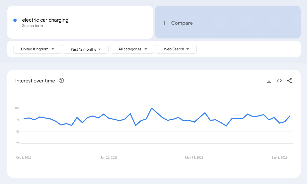
The chart above shows steady demand for the term "electric car charging" from 2023, useful for helping one of our clients who manufacture electric vehicle charging solutions for the home in deciding whether to build a landing page focused on this area.
By analysing these trends, you can gauge the demand for specific search terms. This initial assessment helps in deciding whether to build a landing page centered on that particular topic.
However, to gain deeper insights, engage with your current customers and leads through surveys or polls on platforms like Facebook and X. Analyse the comments on your blog posts and social media to discern your audience's pain points.
That being said, remember that what customers say may not always align with their actions! Therefore, you'll want to dig a bit deeper:
- Conduct thorough research on your target market, including industry trends, customer feedback, and competitor strategies. This will enable you to tailor your messaging and offerings more effectively.
- Analyse user behavior through tracking metrics like bounce rates and conversion rates. Use the data to refine your messaging over time and improve conversion rates.
Understanding the mindset of a landing page visitor
As an online business owner, reorienting your business around your customer's needs is essential. Your landing page should resonate with their desires. The 5-step process consumers undergo before and after purchasing a product or service, as illustrated in the infographic below, sheds light on their mindset:

- Recognition of need: The consumer identifies a specific need and searches for a solution.
- Information search: The search for available products begins.
- Evaluation of alternatives: The consumer explores options, often seeking reviews and pricing information.
- Purchase: After evaluating the store, convenience, and quality, the consumer places an order.
- Post-purchase: The consumer reflects on their shopping experience, including shipping and product condition.
Using social media networks for your market research
Social media presents another avenue to glean insights about your customers. Monitoring discussions about your brand on social media platforms provides valuable data on what customers are saying and where they are saying it. Engaging in conversations with prospects or customers on social media extracts useful information about them, your brand, and your market. Additionally, it fosters a positive brand image and user experience from the outset. While social media can be overwhelming, focusing on platforms where your customers are most active is the key. Platforms like Quora can also prove invaluable for conducting market research.
Getting to grips with keyword intent
To conclude your market research, delve beyond keywords and comprehend the intent behind them, relating it to your target audience. Keyword intent entails understanding what users genuinely seek. Utilising tools like Google Keyword Planner can provide insight into keyword intent. For instance, if you search for "electric car charging," you can discover related keywords and their average monthly search volumes.
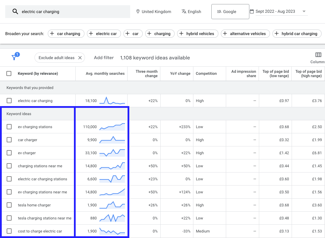
The first keyword under 'Keyword Ideas' shows 'EV charging stations' showing how valuable keyword research is to look at different phrases or terminology that's being used by your potential customers, giving you inspiration for your market research. However, the competition is low, so very few advertisers are bidding for the term.
Analysing this data helps identify valuable keywords that align with your market research. However, it's vital to recognise that optimising for keywords alone may not suffice. Understanding user intent and crafting content that addresses their specific needs is paramount for achieving conversions.
Design your landing page
This section delves into the components that make a perfect landing page. Each element plays a vital role in enhancing conversion rates, and every part of your landing page matters significantly.
Key elements of high-converting landing pages:
Headline
The headline is the foremost and pivotal element of your landing page. It should be bold, clear, and driven by the benefits it offers. Catchy and valuable headlines garner the most social media shares. In fact, it's from an old article, but still very much holds water, 59% percent of social shares originate from individuals who merely read the headline.
This principle applies to landing pages as well. For a lead magnet landing page, your headline must be creative, concise, imbued with a sense of urgency, and capable of solving a specific problem. It needs to magnetise visitors into completing the subscription form.
Supporting subheadline
Never underestimate the significance of a compelling subheadline. A well-crafted subheadline provides context to the main headline, offering readers a reason to delve into the entirety of your content instead of merely skimming it.
Visual focus
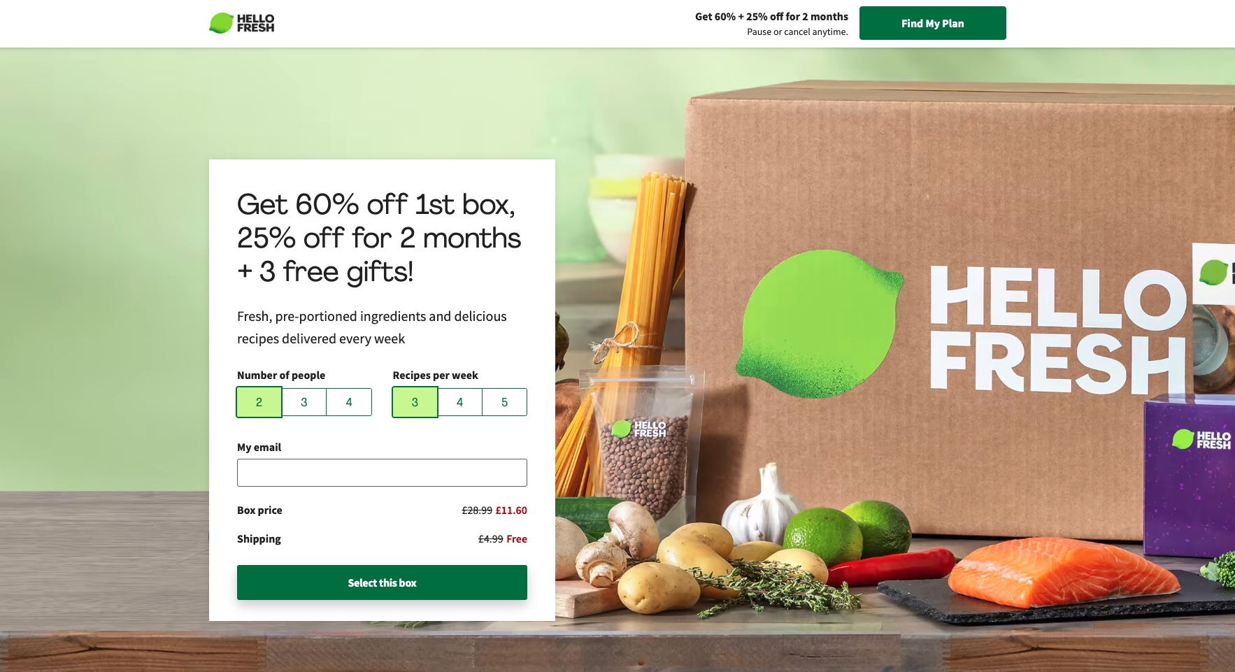
The human brain processes visual information faster than text. Thus, incorporating a visual focal point, such as a headshot, a photo, or a video, can significantly enhance engagement on your landing page. HelloFresh, for example, places a large image of fresh ingredients prominently at the forefront of its landing page.
Customer/client testimonials (optional)
Real customer testimonials can be a potent addition to your landing page, instilling trust and credibility. However, it's advisable to use testimonials only after achieving tangible results for other customers. For newcomers, this element is optional.
Core benefits
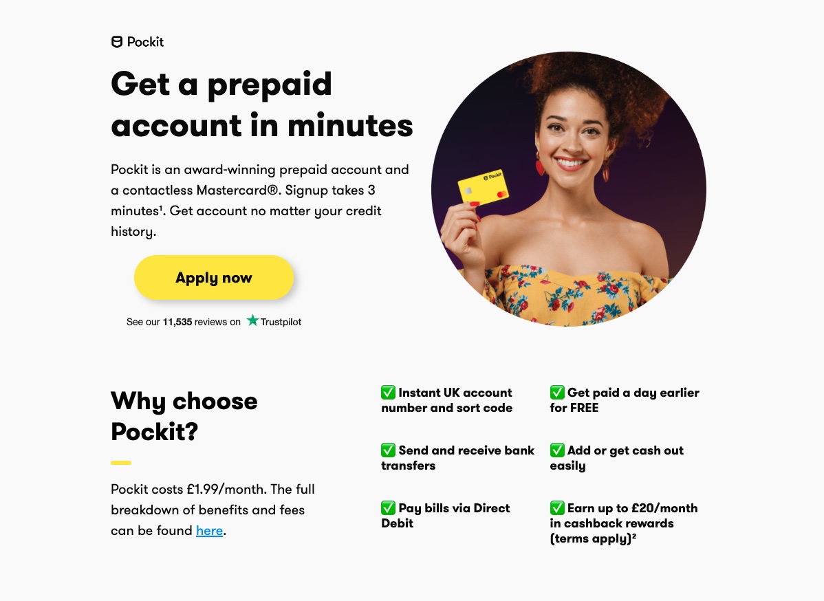
Highlighting the core benefits of your product or service on your landing page is essential. Pockit, effectively accomplishes this on their landing page.
Call-to-Action
Successful conversion of visitors into email subscribers or customers hinges on a simple, clear, and clickable call-to-action (CTA). While links can serve this purpose, CTA buttons are more effective in grabbing attention, particularly when they feature vibrant colours.
Best practices for high-converting landing page design
Clear user interface (UI) and user experience (UX)
For your landing page to work, ensure the user interface is clear. The focus is on your visitor, not you. You must align every element on your landing page to appeal to the end user.
Clean and legible fonts
Given that most consumers browse online using mobile devices, it's imperative to ensure that your landing page is mobile-friendly. Evaluate your landing page's appearance on different mobile devices using tools like MobileTest.me.
Simple and user-friendly navigation
In general, external navigation on your landing page is discouraged. However, if you opt for it, ensure that it remains simple and user-friendly. David Risley's landing page serves as a prime example, featuring a professional appearance, visual focus, clean design, and easy navigation.
The AIDA Model
One of the most renowned practices in content marketing is the AIDA model, which stands for Attention, Interest, Desire, and Action. Implementing this model involves creating captivating graphics to grab attention, delivering valuable content to maintain interest, stoking desire by connecting with product benefits, and culminating in action through a compelling CTA.
Use the psychology of colour to your advantage
In the realm of designing high-converting landing pages, the choice of colours can significantly impact the success of your page. Let's delve deeper into how background colour, link colour, and call-to-action (CTA) colours can either steer your visitors toward conversion or deter them.
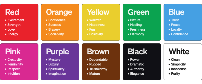
Colour psychology plays a pivotal role in influencing customer behavior and perceptions. To harness this power, consider the impact of colour choices on your landing page's design and branding.
Background colour: Setting the stage
The background colour of your landing page sets the stage for the entire user experience. An ill-chosen background colour can diminish the overall impact of your page. Here are some key considerations:
Contrast is crucial: When opting for a solid background colour, it's imperative to ensure that it doesn't clash with the text. If your chosen colour is deep or vibrant, make certain that the text contrasts sharply against it. This ensures that visitors can easily read and comprehend your content.
Link colour: Navigating the path
While the colour of links may not be the most critical element on your landing page, it still warrants careful consideration. Here's how to approach link colours:
- No universal best colour: There are no universally superior colours for boosting conversion rates.
- Conventional link colours: When incorporating links on your landing page, especially when they serve a specific goal like capturing email leads, it's often advisable to adhere to web conventions. Typically, underlined links are blue, and followed links are maroon.
Encourage creativity: However, don't hesitate to inject creativity into your landing page design. If you find that red links resonate better with your audience, don't hesitate to employ them. Similarly, if green links receive more clicks, feel free to embrace them. The key is to adapt to what works best for your unique context.
Call-To-Action Colours: Eliciting Action
The colour of your Call to Action (CTA) buttons plays a pivotal role in motivating or deterring visitors from taking action. Here's how to approach CTA button colours:
Consider colour psychology: Different colours convey distinct emotions and perceptions. It's crucial to think about what each colour symbolizes and how consumers will interpret them.
- Pink: Symbolizes unconditional love and is often used to target a female audience due to its feminine associations.
- Orange: Radiates warmth and happiness.
- Blue: Represents trust and peace, making it suitable for building trust and loyalty, particularly when selling digital products.
- Red: Often associated with urgency and excitement and can be effective in driving immediate action.
Industry and Context Matters: Keep in mind that the choice of CTA button colour can vary by industry and specific marketing campaigns. Testing and measuring results are crucial to identifying the most effective colour for your unique context.
Include the 'must haves' for a compelling landing page
Crafting a high-converting landing page requires careful attention to several essential elements. These "must-haves" serve as the foundation for creating a compelling user experience that drives conversions.
- Effective headline:
Your headline is the first thing visitors see when they land on your page, making it crucial for capturing their attention and communicating your offer's value proposition. Craft a headline that is clear, concise, and compelling, focusing on the primary benefit or solution your offer provides. Use persuasive language that resonates with your target audience and entices them to explore further. - Clear 'Call to Action' (CTA):
A clear and compelling call to action is essential for guiding visitors towards the desired action, whether it's making a purchase, signing up for a newsletter, or downloading a resource. Your CTA should be prominently displayed on the page, using action-oriented language that prompts immediate action. Make it easy for visitors to understand what step to take next and ensure that your CTA stands out visually. - An offer:
Your landing page should clearly communicate the offer or incentive that visitors will receive in exchange for taking action. Whether it's a special discount, free trial, or exclusive content, your offer should provide value and compel visitors to act. Highlight the benefits of your offer and emphasise why it's worth their time and attention. - Narrow focus:
A successful landing page maintains a narrow focus on a specific goal or objective, avoiding distractions that could dilute its effectiveness. Keep your messaging concise and focused, directing visitors towards the desired action without overwhelming them with unnecessary information. Remove any elements that don't directly contribute to achieving your conversion goal and ensure that every element on the page serves a purpose. - VIA: Very Important Attributes:
VIA stands for Very Important Attributes, which are the key features or benefits of your offer that set it apart from the competition. Identify the VIA of your offer and highlight them prominently on your landing page. Whether it's unique features, competitive pricing, or exceptional quality, make sure visitors understand why your offer is superior and why they should choose it over alternatives. - Strong visuals:
Visual elements such as images, videos, and graphics play a crucial role in capturing visitors' attention and conveying your message effectively. Use high-quality visuals that are relevant to your offer and help to reinforce your value proposition. Visuals should complement your copy and engage visitors visually, making your landing page more memorable and compelling. - Social proof:
Social proof is a powerful persuasion technique that can help build trust and credibility with your audience. Incorporate testimonials, reviews, case studies, and endorsements from satisfied customers to demonstrate the value and effectiveness of your offer. Social proof reassures visitors that others have had positive experiences with your product or service, making them more likely to convert.
Conclusion
It's equally crucial not to underestimate the impact of landing pages on your business's success.
When it comes to creating high-converting landing pages, there's no one-size-fits-all approach. It's essential to explore various models and strategies to find what resonates best with your company and your unique offerings.
Begin by gaining a deep understanding of your target audience and what motivates them. Address their pain points with empathy and precision, crafting landing pages that offer compelling solutions to their needs. Incorporate clear Calls to Action (CTAs) to prompt immediate action and watch as your conversion rates soar.
Don't overlook the importance of including all the essential elements covered above on your landing pages. Test different variations to optimise performance and ensure maximum effectiveness in driving conversions.
By prioritising these strategies and continuously refining your approach, you'll unlock the full potential of your landing pages and propel your business towards greater success in the digital landscape.


