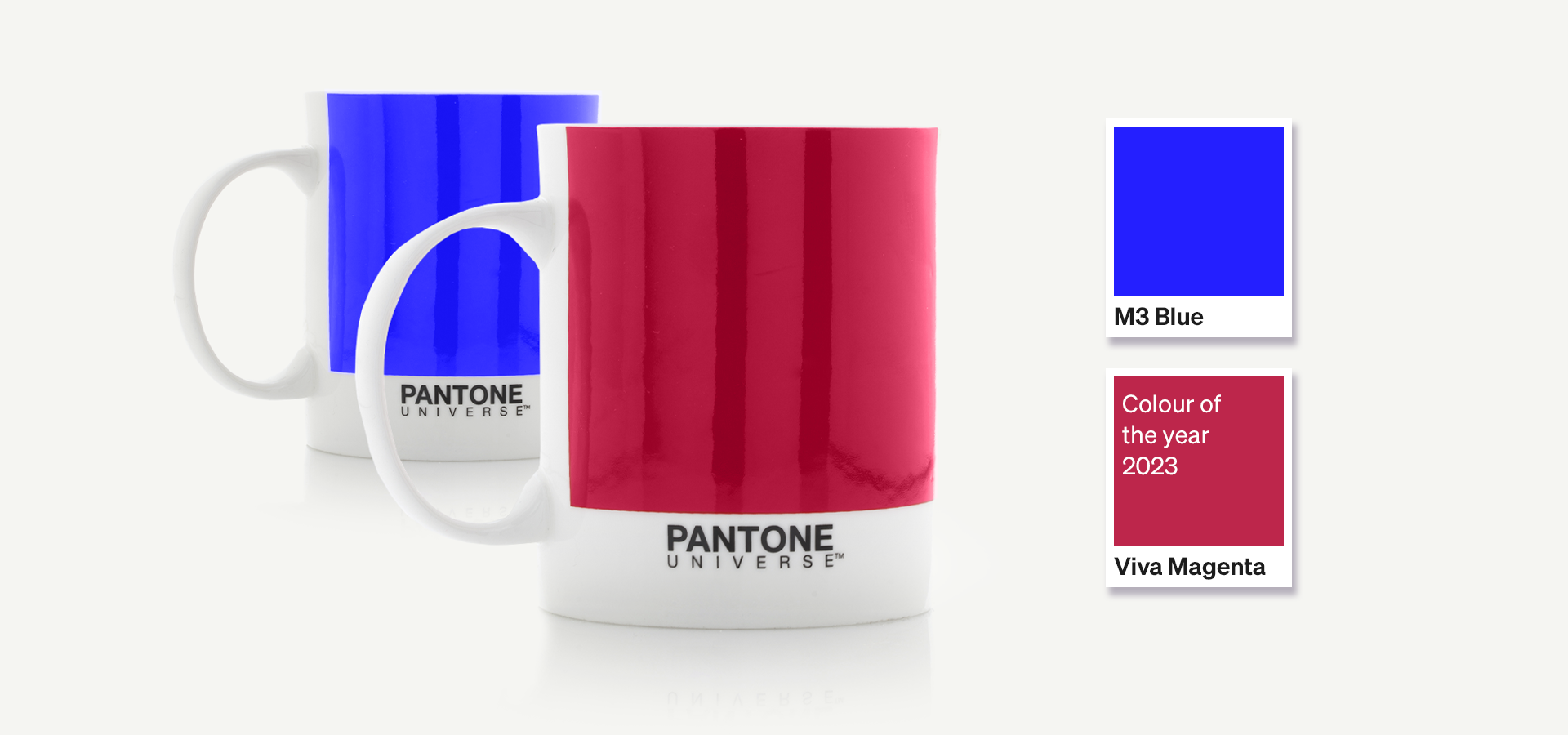
As a leading creative marketing agency, it’s important for us to make sure we’re on top of the latest design trends. And, for the past six months we've closely analysed and debated the importance of colour and the vital role it plays within the development of our own rebrand.
The Pantone Colour of the Year is a great source of inspiration and guidance across creative industries, from fashion, interior design, marketing and advertising. In this blog, we’ll share our thoughts on this year’s colour of the year and explain just why the colour of the year is such a big deal to agencies like us!
So what is the Pantone Colour of the Year?
The Pantone Colour of the Year is selected by a panel of designers and creatives across industries to represent the current cultural climate. Who remembers millennial pink and how grey became the new go-to neutral colour in interior design? Well, both of these colours were colour of the year in recent times, which goes to show how Pantone is on point in highlighting new colour trends.
How do colour trends help create great marketing campaigns?
Incorporating the latest colour trends into marketing campaigns can help businesses to connect with prospective customers on a deeper level. By using the colour of the moment you’re able to talk to customers in their own language and tap into the cultural zeitgeist, and we know customers are more likely to convert when they feel understood.
Not only can using the right colour help communicate with your customers better, but it can also help you to stand out and gain attention against the competition.
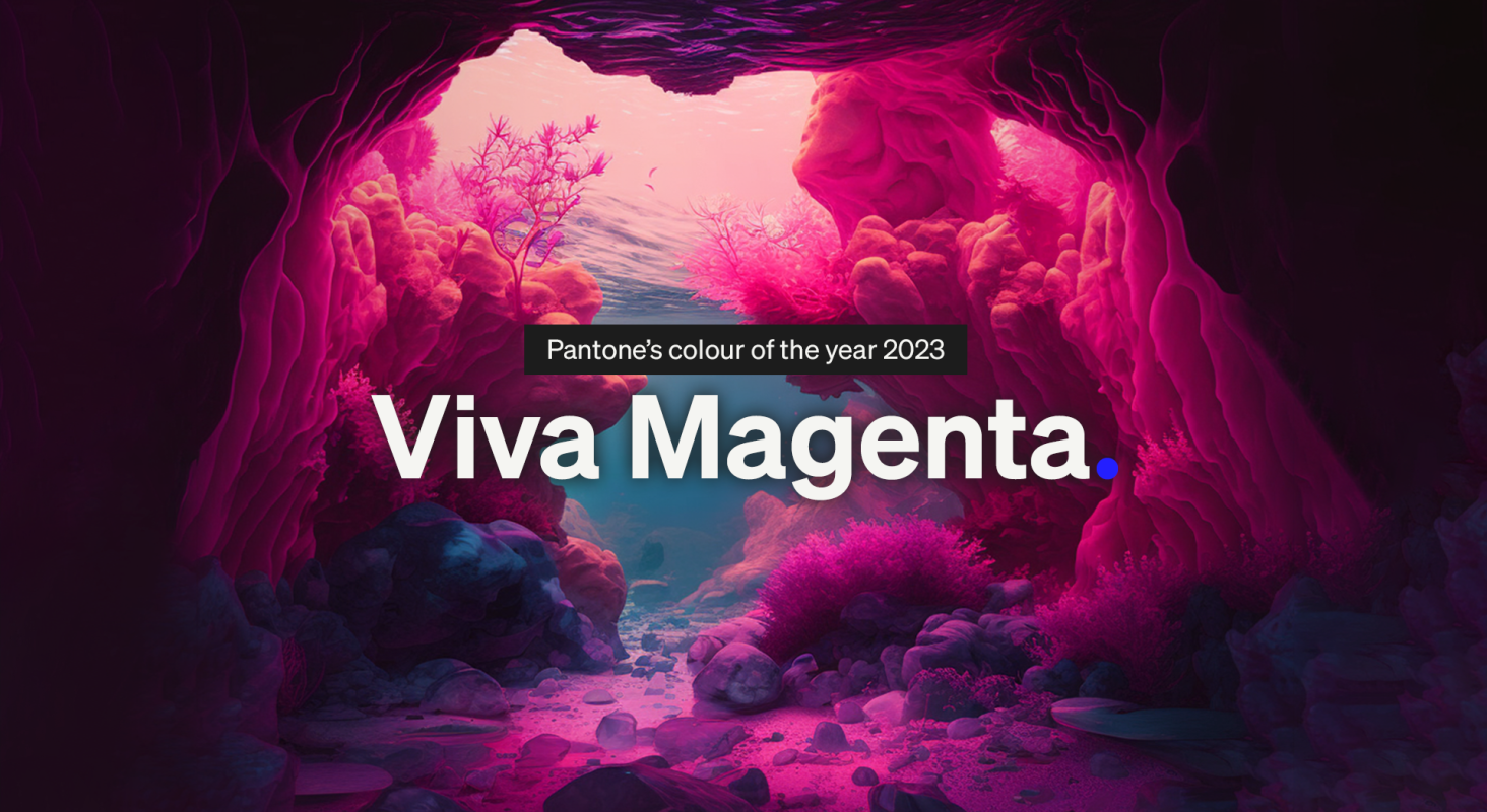
Viva Magenta
Viva Magenta is a warm, bold colour in the red family. It signifies energy, creativity and innovation. In recent years graphic design has favoured neutral colours, especially for artwork designed to be consumed on screens. Viva Magenta sets out to disrupt this and cuts through the space.
Viva Magenta can be used sparingly to add a pop of colour to creative campaigns or, used to create a memorable visual identity and stand out in a crowded market.
What’s our take on it?
We sat down with our new Senior Designer Darren Titler to get his thoughts on this year’s Pantone Colour of the year.
“Viva la magenta! This year’s all about embracing the opposites of pure innocence and burning passion with Pantone’s colour of the year ‘Viva Magenta’ – and I couldn’t agree more. Magenta is one of the most diverse colours in the spectrum, capable of evoking a wide range of emotions from nurturing and nostalgic, to playful and passionate. Whatever your usage, have fun and embrace a lot more magenta in your life.”

For the past 6 months we've closely analysed and debated the importance of colour and the vital role it plays within the development of our own rebrand. In short, we know how the use of colour can be crucial in effective branding and creative campaigns, and Viva Magenta is a colour that’s bold and unconventional.
Here at M3, we’re masters of branding, design and advertising. So, if you’re looking for a way to help your business stand out from the crowd, why not contact us to see how we can help today.


