Like every industry, Graphic Designers can sometimes seem to have our own language, but as much as we try to keep things simple, we do sometimes slip into 'geek speak'…
So, if you’ve ever been left baffled by bleed, confused by crop, or our typography has you in a twist, hopefully this short guide with a few basics will help!
Typography
Typography is a fundamental part of design - put simply, it is the art of text. It can be both functional and highly creative. Ranging from something as simple as a perfect font choice to intricate hand-drawn lettering, typography can form the basis of the design or it can be a complimentary flourish.
The technical aspects of typography still use many of the techniques and terminology from traditional letterpress printing, like 'leading' - the space between lines which was separated with lead blocks in traditional letterpress printing. A few of us from M3 had the chance to go on a traditional letterpress printing day, and Bec wrote this great blog which covers some of the traditional processes which we still use 'digitally' today.
Resolution
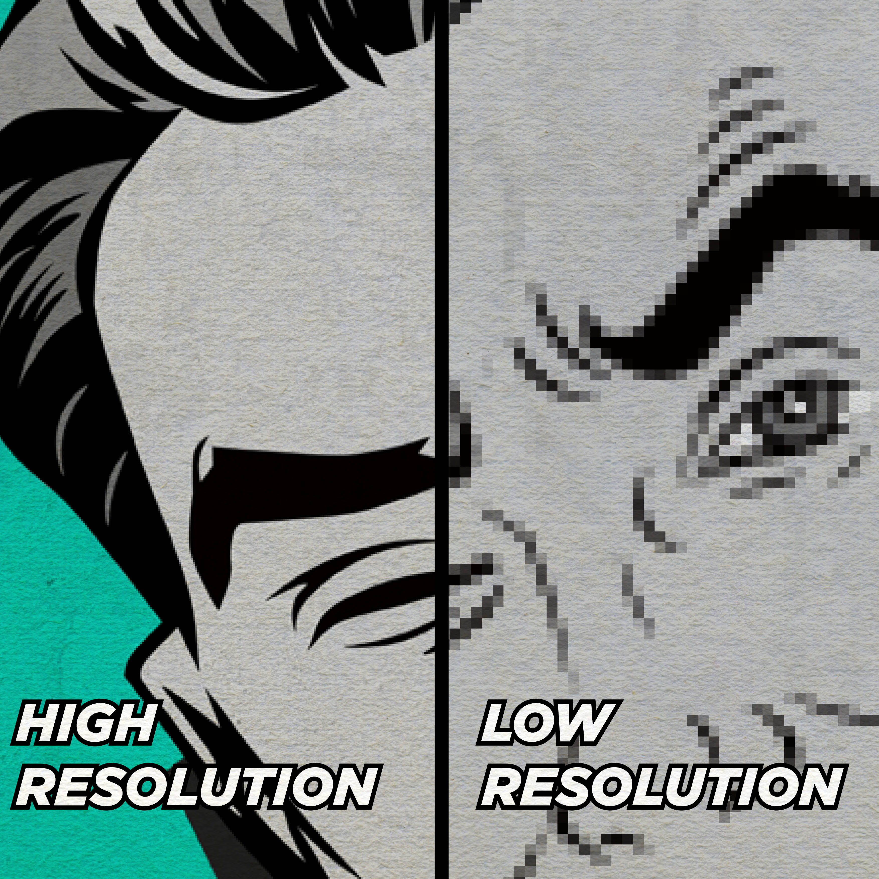
Resolution is the detail that is held within an image. Imagine a really poor-quality pixelated image - that's 'low resolution'. Because of this, if we're using supplied photography in a design, we may sometimes request a higher resolution image if the image supplied is going to look too poor quality - especially if it's going to be printed!
To understand the resolution of an image we use a measurement called PPI or DPI - pixels/dots per inch - as you might guess this tells us how many pixels or dots are in every square inch of the image. For standard printing, we stick to a minimum of 300 DPI to ensure sharp printed images, but for web images we drop down to 72DPI because this is the best for sharp images when viewed on screen.
Resolution can get more complex because there is also an 'effective PPI/DPI' - this is the effective resolution of an image when it is used at a percentage other than 100%, for example, a 300DPI image that is printed twice as big as its original size will be 150DPI, likewise an image with a low resolution may be printed smaller to increase its effective DPI.
Vector vs Raster
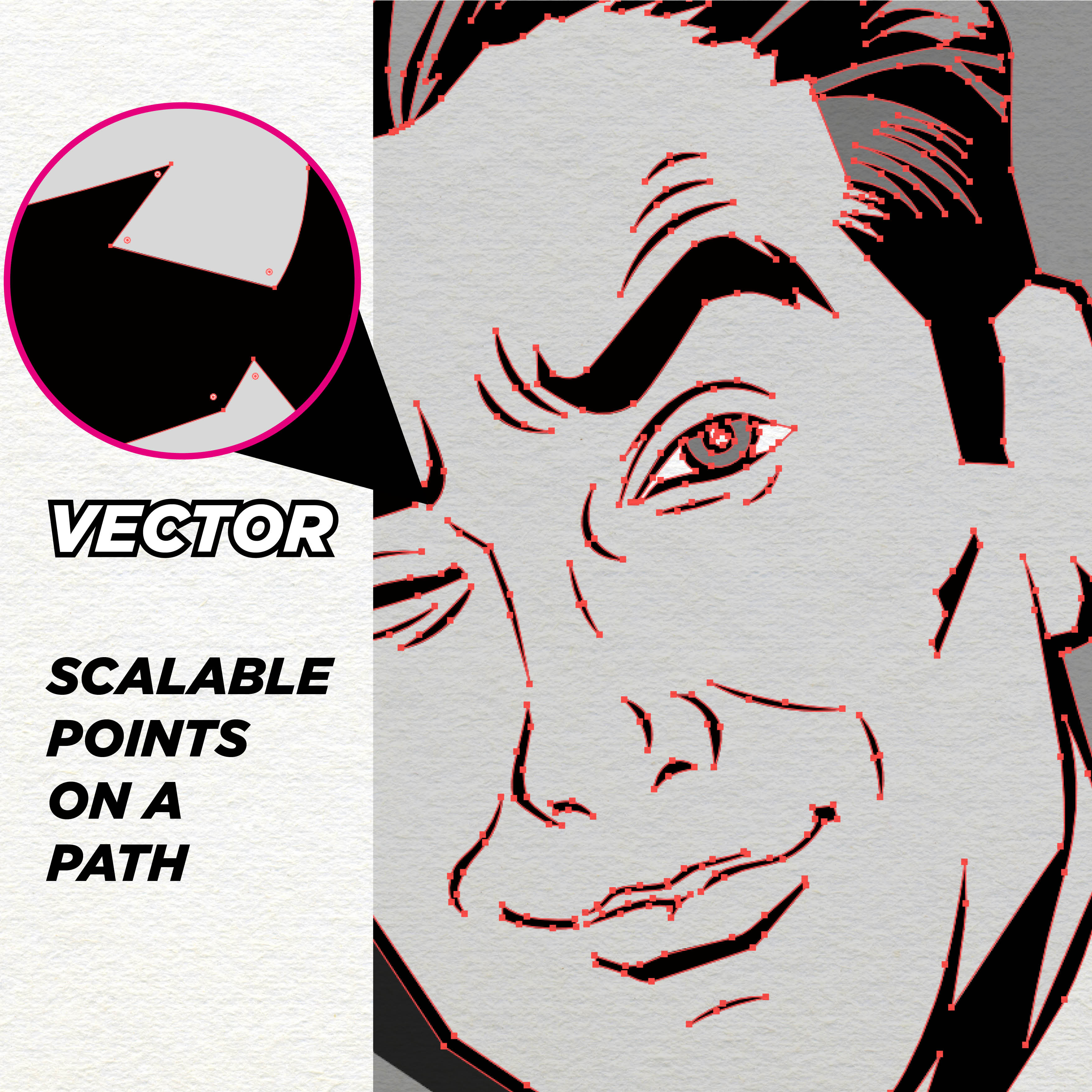
A vector image (usually an EPS, AI or SVG file) is an image which is made using a series of scalable points rather than pixels - meaning it doesn't lose quality when resized. This makes them great for logos, large format prints or jobs that require special print processes such as spot colours.
But whilst vector is great for many uses, it's only really designed for simple images like icons, logos or certain styles of illustration - and this is where raster comes in.
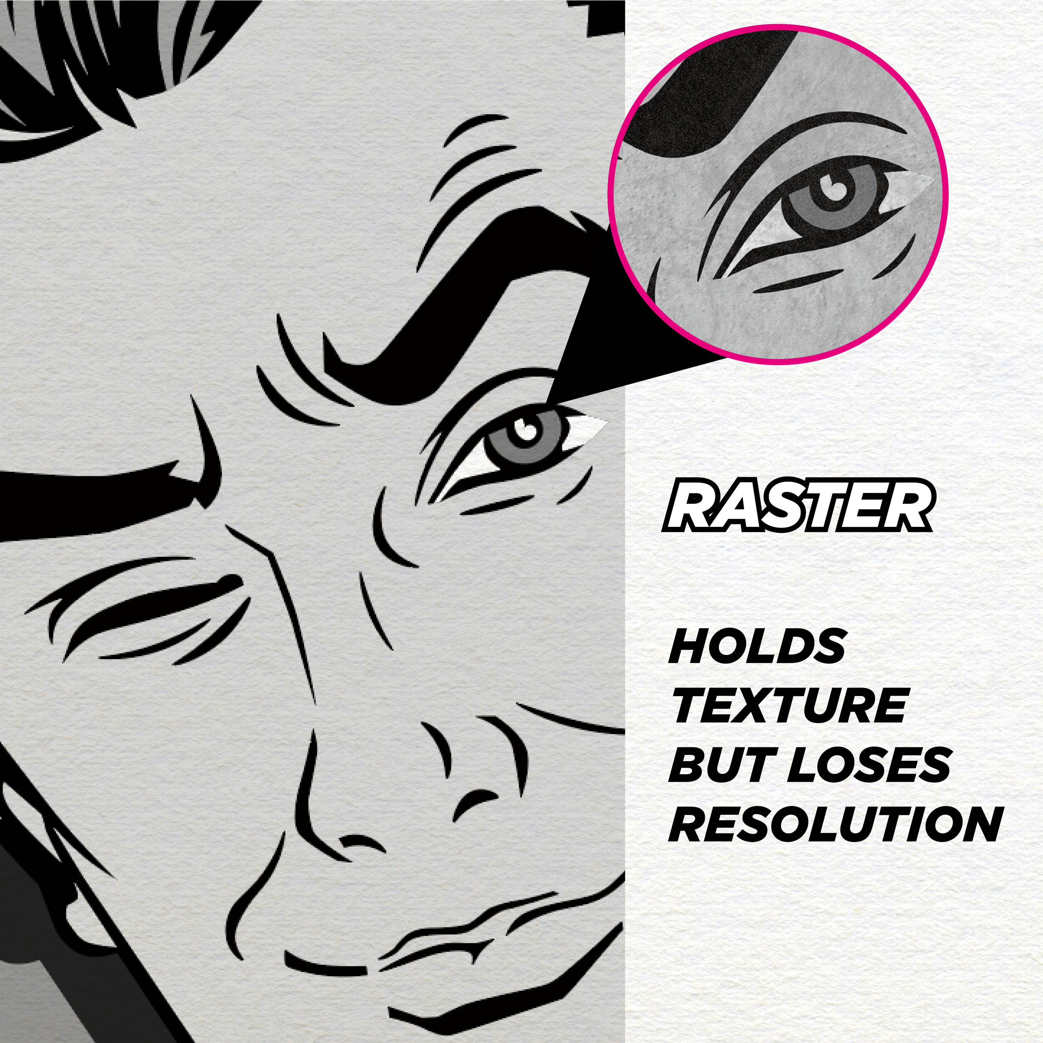
Raster images are conventional 'flat' images (usually a JPEG, PNG or TIF), they're made of pixels which means they are a finite size, and beyond their maximum size they will begin to pixelate. Whilst this may sound like a downside, being made of pixels means they can hold a lot more graphical information such as noise, texture and complex shading that a vector images cannot hold.
Bleed and Crop
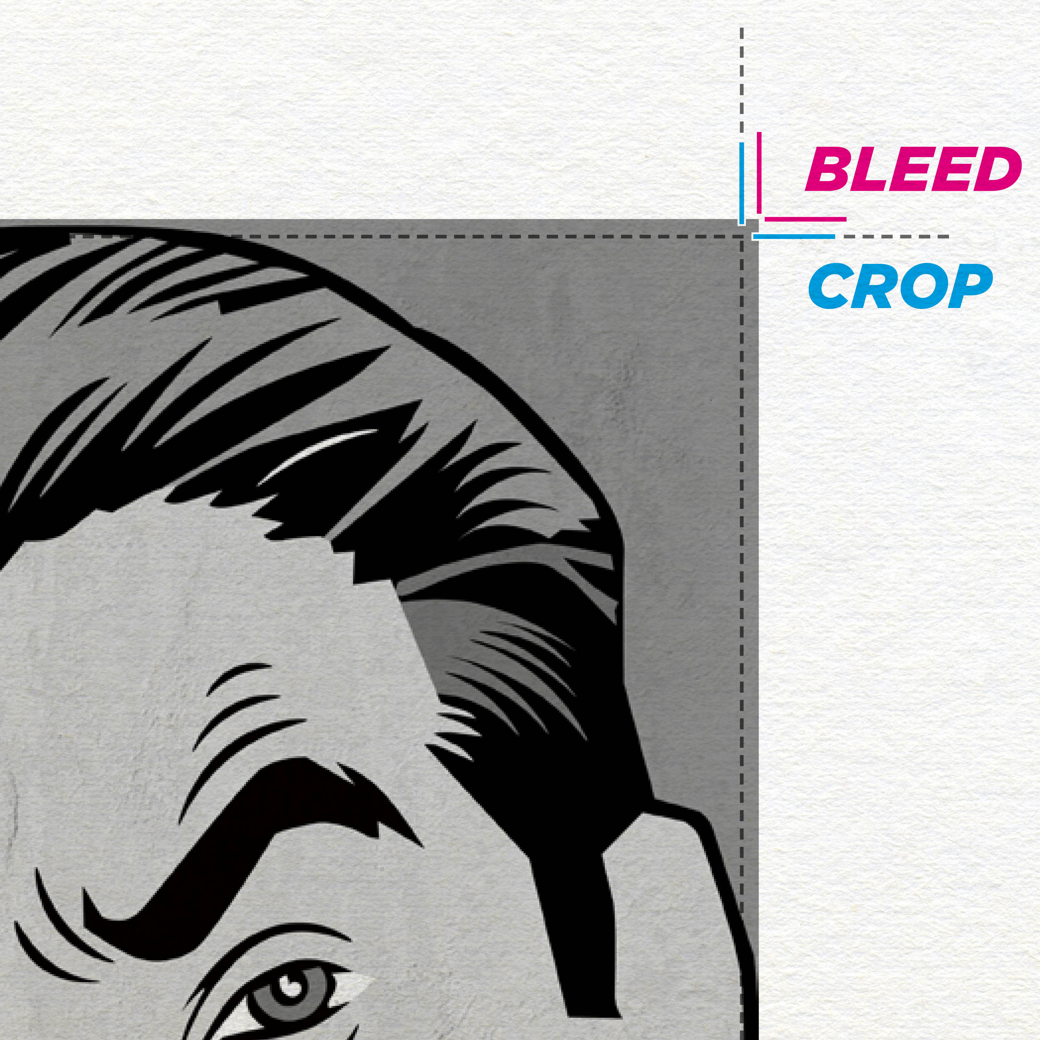
When printing professionally, a print job is usually printed out of much larger sheet sizes than standard; this means that many pages can be printed and 'trimmed' from one sheet - which makes it more cost effective. Because of this, on an untrimmed design (or proof) you may see lines in the corner which show the printers where to crop.
Likewise, with bleed, in order to avoid the risk of a white edge when trimmed, the design is made slightly larger than what is needed in the finished print size to allow for any slight movement in the trimming. This is called bleed - and is also shown by a second set of lines.
…So, whilst this may not be a comprehensive list, it may help clearing up some of the Graphic Design 'geek speak', and always if there's anything you don't understand - just ask! Get in touch with us today if you need more information on graphic design, or you're interested in the services we provide at M3.Agency.
